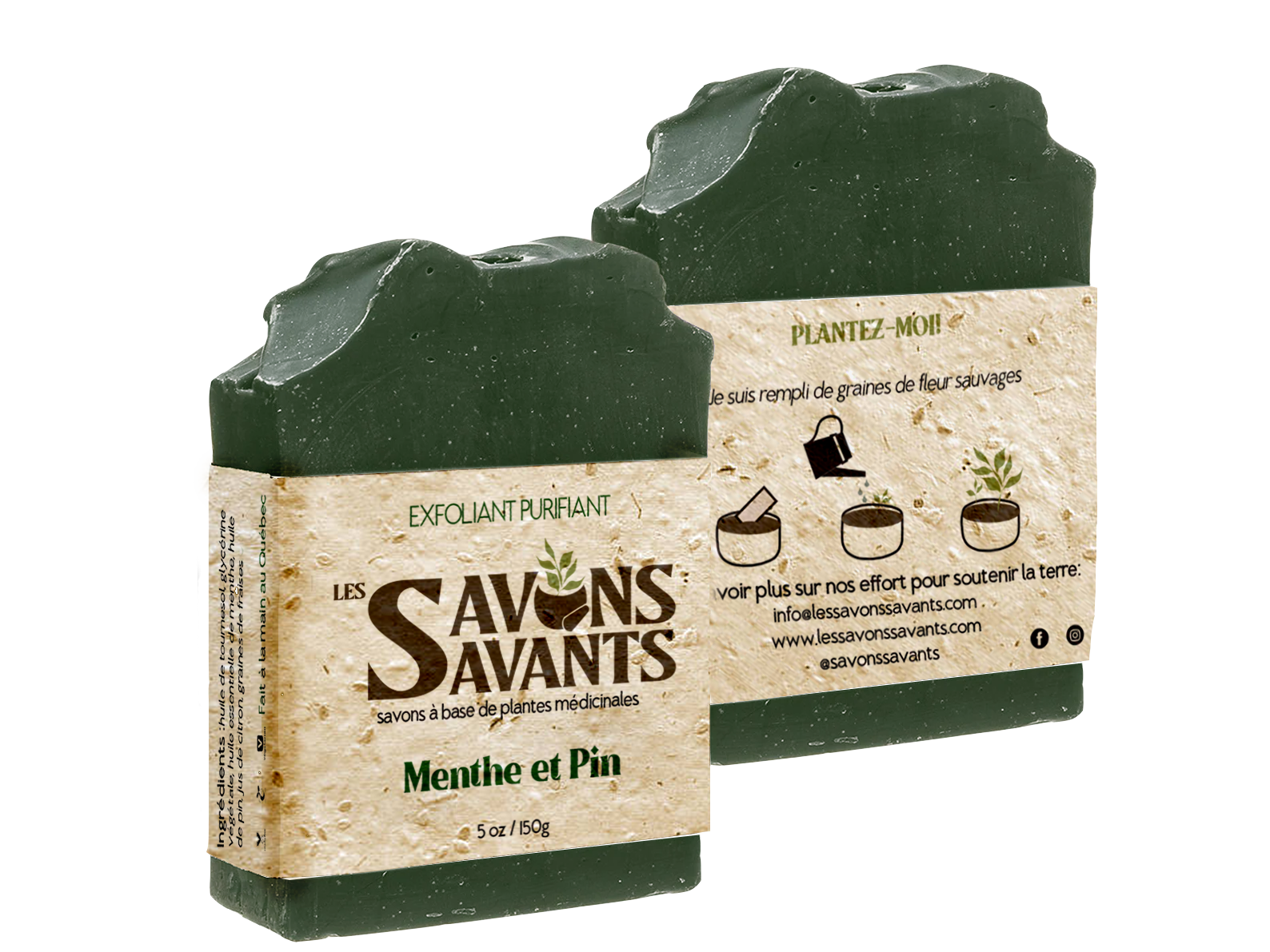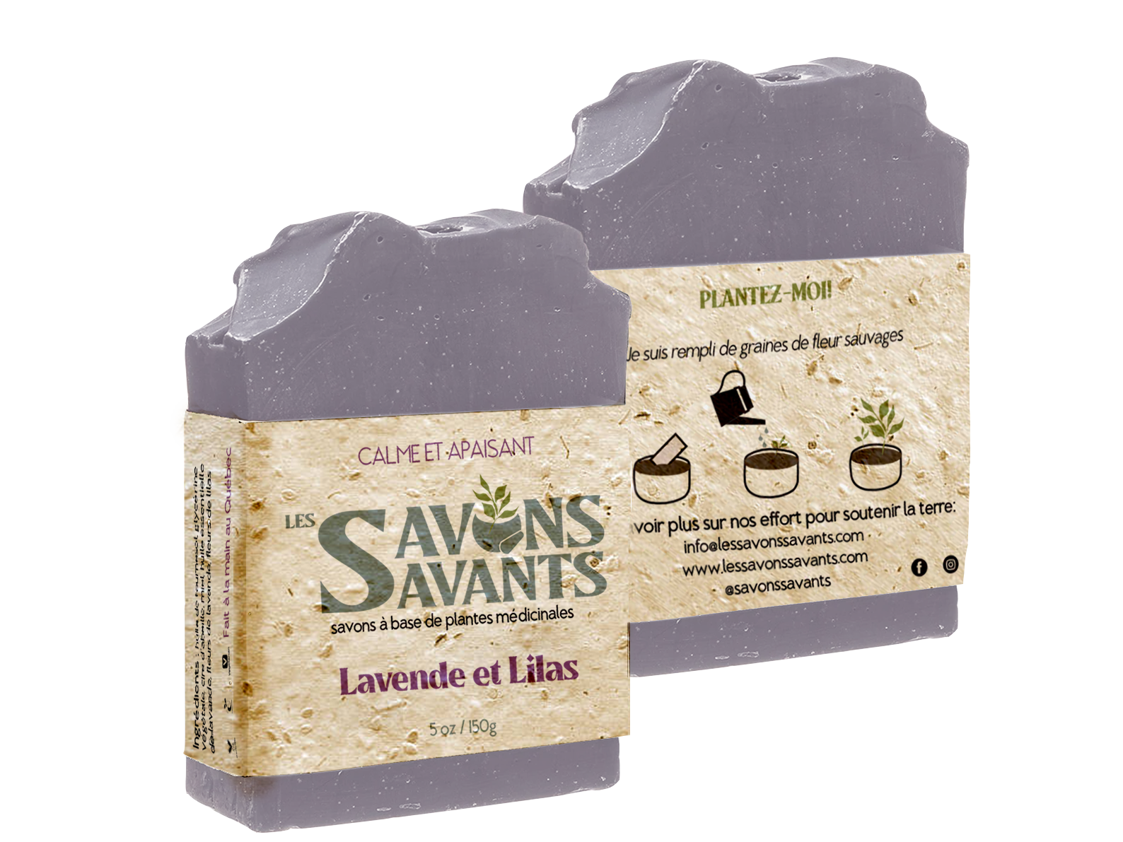
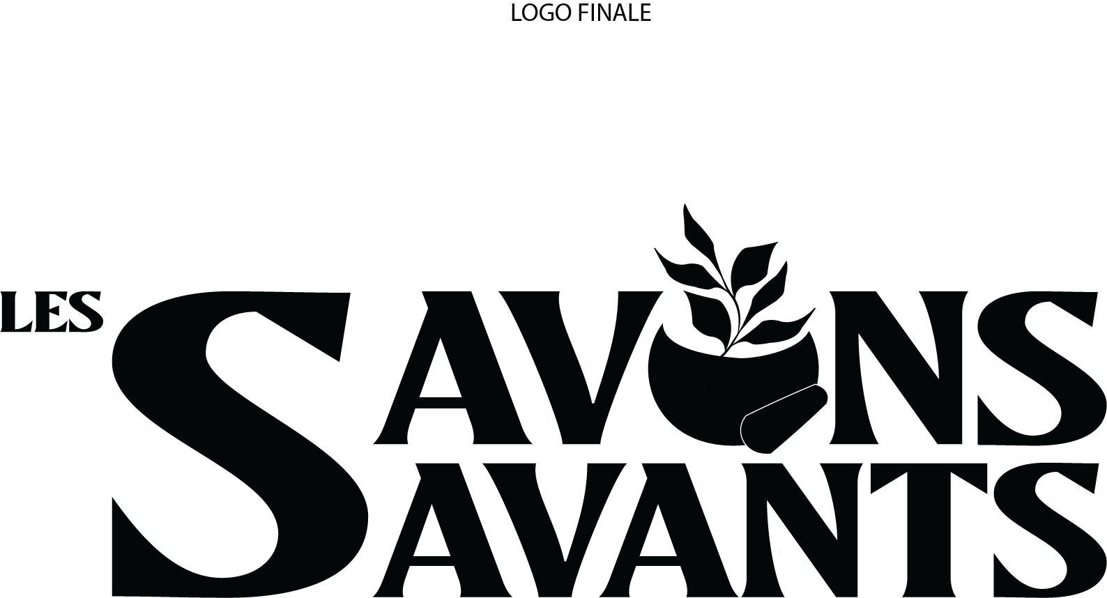
The purpose of this project was to design a logo and packaging for a soap company called "Les Savons Savants". This Quebec company of soaps is made with local medicinal plants that have various benefits for the skin.
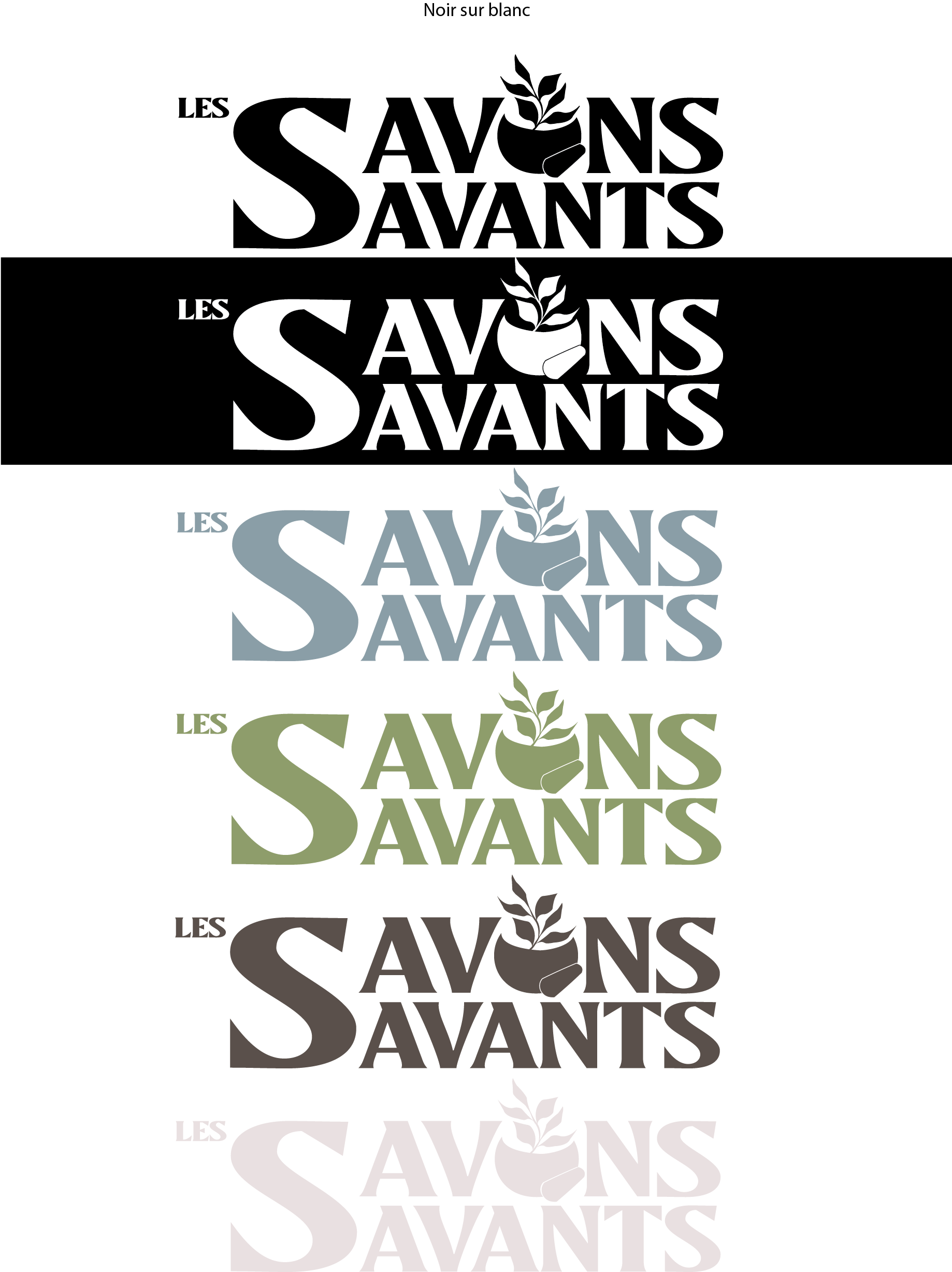
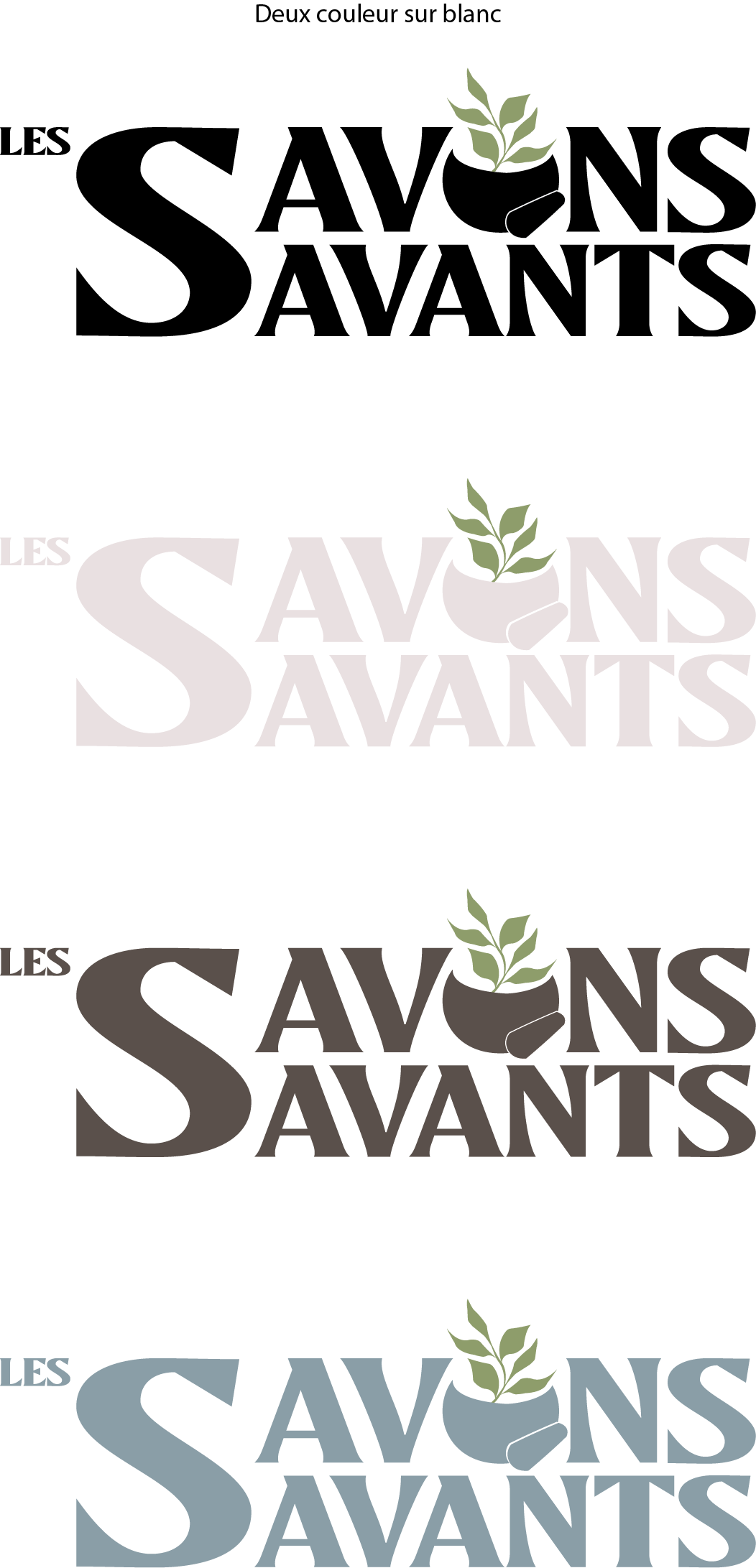
LOGO INSPIRATION
Design is playful and encompasses an earthy, natural feel.
Inspired by apothecary methods, a mortar and pestle represent how products are made by hand, with natural ingredients.
In the color logo versions, the plant is always in green to represent the fresh ingredients.
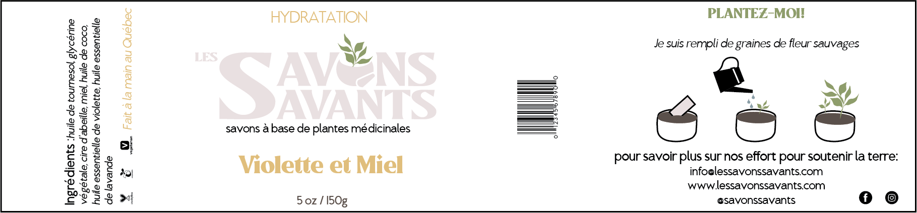
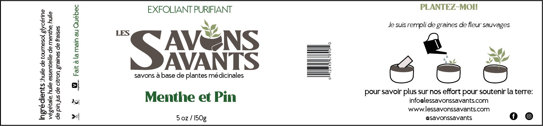
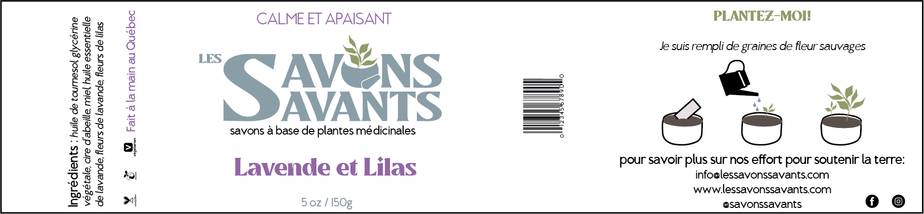
PRODUCT DESIGN
I had the flexibility to choose the soap ingredients highlighted for each product.
I researched what benefits for the skin Canadians and Quebecers look for when purchasing soap. This was combined with actual ingredients that are grown in Quebec and provide those benefits for the skin.
This is how I came up with the 3 different products and used that to tailor each packaging label to highlight the difference of each soap bar that was also consistent with the brand.
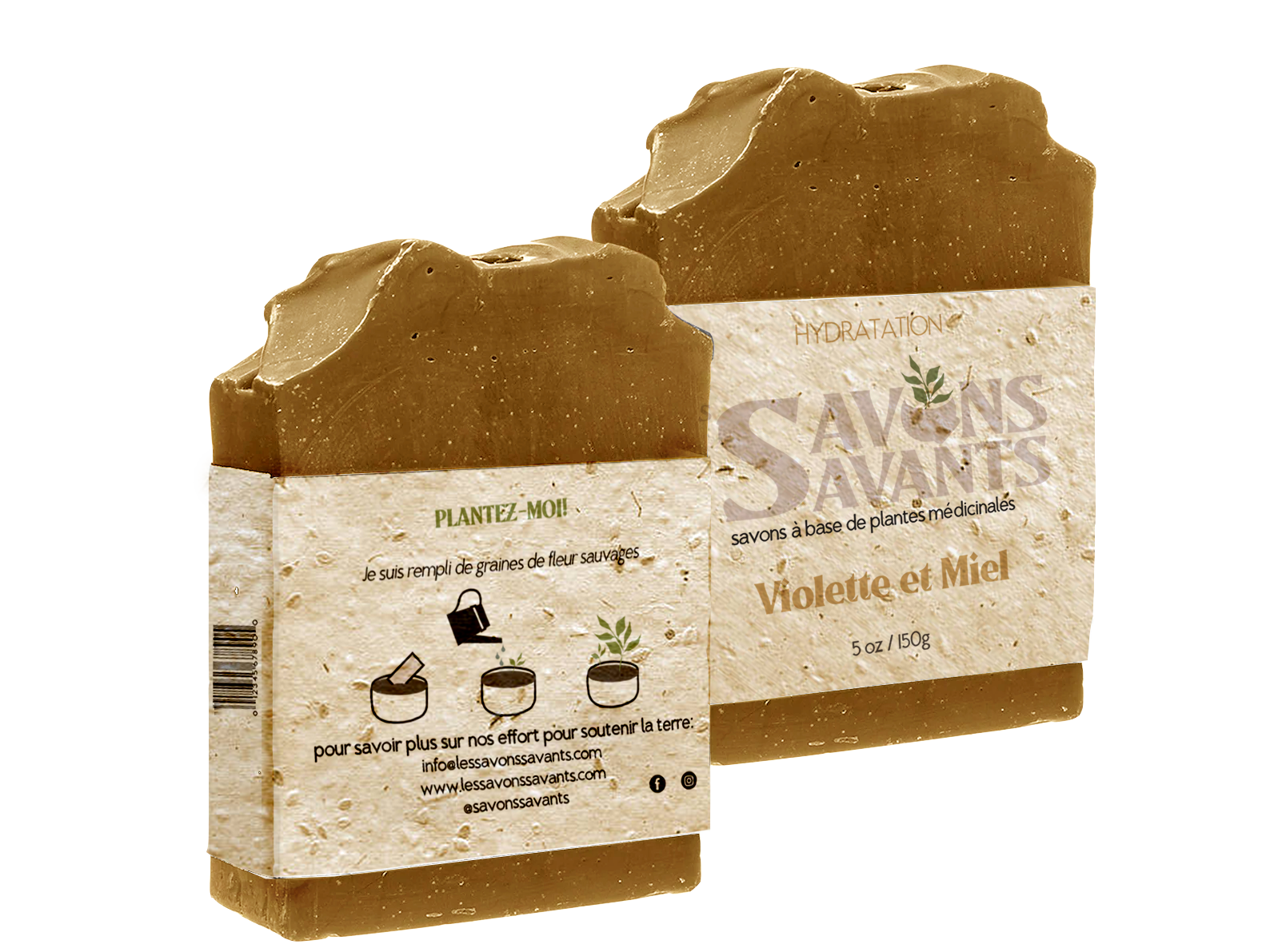
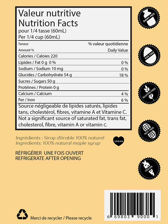
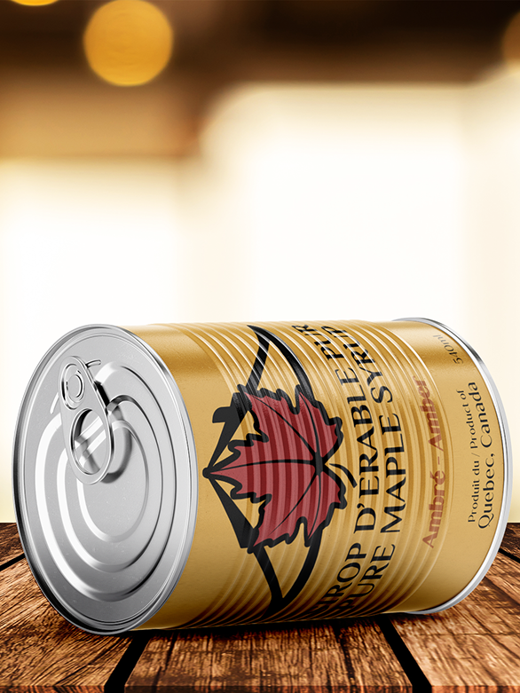
PACKAGING DESIGN
As this brand values natural ingredients, is made by hand and cruelty free, I made several decisions to highlight and stay true to the brand:
- Icons to communicate the product is vegan and cruelty free.
- Highlight that is is made locally by hand in Quebec.
- Minimal packaging printed on seeded paper to create zero waste.
- Visual instructions to easily encourage consumers how to reuse the packaging.
- Brand resources for consumers to get more information and follow the brand virtually.